Atlas of stylesAtlas de estilos
Swiss International Typographic StyleEstilo tipográfico suizo: retícula, Helvetica y foto objetiva
Suiza-Alemania, 1957-1970Josef Müller-Brockmann, Armin HofmannTipografía y letteringRarity 3/5Rareza 3/5JSON
The Swiss International Typographic Style is a rationalist graphic design system developed in Switzerland and Germany around 1957-1970, led by Josef Müller-Brockmann, Armin Hofmann and the Basel and Zurich schools. It champions clarity, objectivity and universal communication. Unmistakable for its strict modular grid, asymmetric layouts, sans-serif typography especially Helvetica and Akzidenz-Grotesk, generous white space, and objective photography, it presents information with mathematical order and legible hierarchy, rejecting decoration in favor of function.
El Estilo Tipográfico Suizo Internacional es un sistema de diseño gráfico racionalista desarrollado en Suiza y Alemania entre 1957 y 1970, encabezado por Josef Müller-Brockmann, Armin Hofmann y las escuelas de Basilea y Zúrich. Defiende la claridad, la objetividad y la comunicación universal. Inconfundible por su retícula modular estricta, maquetación asimétrica, tipografía sin serifas sobre todo Helvetica y Akzidenz-Grotesk, abundante espacio en blanco y fotografía objetiva, presenta la información con orden matemático y jerarquía legible, rechazando la decoración en favor de la función.
Visual vocabularyVocabulario visual
Visual language is built on geometric order and reduction. Dominant forms are rectangles, bars, circles and thin rules used as dividers and markers. Lines are clean, precise and uniform; no hand-drawn or decorative flourishes. Motifs favor objective black-and-white photography, abstract geometric illustrations, and large flat color blocks. The palette is restrained: white, black and strong primary red, plus cool grays, yellow and blue as accents. Ornament is deliberately absent; emphasis comes from scale contrast, weight hierarchy, negative space and bold typographic blocks aligned to the grid for maximum legibility and neutrality.
El lenguaje visual se basa en el orden geométrico y la reducción. Predominan rectángulos, barras, círculos y filetes finos como divisores y marcadores. Las líneas son limpias, precisas y uniformes, sin trazos manuales ni florituras. Los motivos privilegian la fotografía objetiva en blanco y negro, ilustraciones geométricas abstractas y grandes bloques de color plano. La paleta es contenida: blanco, negro y rojo primario intenso, más grises fríos, amarillo y azul como acentos. No hay ornamento; el énfasis nace del contraste de escala, el peso tipográfico, el vacío y los bloques alineados a la retícula para máxima legibilidad y neutralidad.
CompositionComposición
Composition is governed by the modular grid, often 6 to 12 columns with consistent gutters and margins. Layouts are asymmetric yet perfectly balanced, with elements aligned flush left, ragged right. Hierarchy is established by size, weight and position, not decoration. Large headlines anchor corners while body text forms compact, justified or left-aligned blocks. Photography is cropped geometrically and integrated as a structural module. White space is active, guiding the eye through a clear, sequential reading path from top-left to bottom-right.
La composición se rige por la retícula modular, a menudo de 6 a 12 columnas con medianiles y márgenes constantes. Las maquetas son asimétricas pero perfectamente equilibradas, con elementos alineados a la izquierda y bandera a la derecha. La jerarquía se logra por tamaño, peso y posición, no por decoración. Grandes titulares anclan las esquinas mientras el texto forma bloques compactos justificados o alineados a la izquierda. La fotografía se recorta de forma geométrica y se integra como un módulo estructural. El blanco es activo y guía la lectura en un recorrido claro de arriba a izquierda hacia abajo a derecha.
Texture and techniqueTextura y técnica
Originally created for offset lithographic printing on matte and coated papers, with spot colors and precise registration. Techniques included phototypesetting, paste-up with ruling pens, and halftone photography reproduction. Textures are smooth, flat and industrial: crisp paper, sharp ink edges, no grain or brushwork. Today it translates to vector precision, pixel-perfect grids and high-contrast printing. The digital equivalent maintains that clean, press-ready finish with anti-aliased sans-serifs, solid fills and mathematically exact alignment.
Creado originalmente para impresión offset litográfica sobre papeles mate y estucado, con tintas planas y registro preciso. Las técnicas incluían fotocomposición, montaje con originales pegados y reproducción fotográfica de medios tonos. Las texturas son lisas, planas e industriales: papel nítido, bordes de tinta definidos, sin grano ni pincelada. Hoy se traduce en precisión vectorial, retículas perfectas al píxel e impresión de alto contraste. Su equivalente digital mantiene ese acabado limpio y listo para imprenta con sin serifas nítidas, rellenos sólidos y alineación matemáticamente exacta.
LetteringLetras
Typography is the core. Sans-serif neo-grotesks dominate: Helvetica, Univers, Akzidenz-Grotesk and later Neue Haas Grotesk. Set in tight leading, flush left, often in mixed sizes of the same family to create hierarchy. All-caps or all-lowercase is common for headlines. Tracking is even, kerning is optical and precise. No scripts, serifs or decorative type. Numbers and punctuation align to baseline grids with extreme clarity and uniformity.
La tipografía es el núcleo. Dominan las neogrotescas sin serifas: Helvetica, Univers, Akzidenz-Grotesk y luego Neue Haas Grotesk. Compuestas con interlineado ajustado, alineación a la izquierda y bandera derecha, a menudo mezclando tamaños de la misma familia para jerarquizar. Son comunes los titulares en mayúsculas o minúsculas sostenidas. El tracking es regular y el kerning óptico y preciso. Nada de scripts, serifas ni tipos decorativos. Números y puntuación se alinean a la retícula base con claridad y uniformidad extremas.
Why almost nobody uses itPor qué casi nadie lo usa
Although hugely influential in design education, it is underrepresented in AI image generators trained on illustration-heavy, vintage or ornamental datasets. Its minimalism, subtle grid logic and typographic nuance are harder to prompt than flamboyant styles. Yet its value today is immense for brands and interfaces needing credibility, accessibility and timelessness, offering a neutral, highly legible system that cuts through visual noise and works flawlessly across print, web and signage.
Aunque es muy influyente en la formación del diseño, está poco representado en generadores de imagen de IA entrenados con bases más ilustrativas, vintage u ornamentales. Su minimalismo, lógica sutil de retícula y matiz tipográfico son más difíciles de describir que estilos vistosos. Sin embargo hoy aporta un enorme valor a marcas e interfaces que necesitan credibilidad, accesibilidad y atemporalidad, ofreciendo un sistema neutro y muy legible que destaca entre el ruido visual y funciona perfecto en impreso, web y señalética.
What gives a cheap imitation awayQué delata una imitación barata
Cheap imitations center everything, use decorative fonts, add drop shadows, gradients or textures, and ignore the grid. Common giveaways are bad hyphenation, uneven margins, mixing too many typefaces, using serif or rounded fonts, over-saturation of color, and tilted or scattered elements masked as modern. True Swiss style never looks random; it is asymmetric but rigorously aligned, with disciplined white space and uncompromising typographic hierarchy.
Las imitaciones baratas centran todo, usan fuentes decorativas, añaden sombras, degradados o texturas e ignoran la retícula. Delatan la copia la mala partición silábica, márgenes desiguales, mezclar demasiadas tipografías, usar serifas o letras redondeadas, saturar el color y dispersar elementos inclinados haciéndolos pasar por modernos. El estilo suizo auténtico nunca luce aleatorio; es asimétrico pero rigurosamente alineado, con blancos disciplinados y jerarquía tipográfica inflexible.
Ideas for todayIdeas para hoy
- Poster for a contemporary art museum: large red and black typographic hierarchy on white grid, with a cropped objective photograph of the building as a single module.Cartel para un museo de arte contemporáneo: gran jerarquía tipográfica en rojo y negro sobre retícula blanca, con fotografía objetiva recortada del edificio como un módulo único.
- Minimalist brand identity for a sustainable tech startup: grid-based system using Helvetica Now, black, white and signal red, with modular business cards and website layouts.Identidad minimalista para una startup tecnológica sostenible: sistema reticular con Helvetica Now, negro, blanco y rojo señal, con tarjetas y web modulares.
- UI for a puzzle or strategy videogame: clean HUD, grid-aligned data panels, sans-serif type, flat icons and high-contrast legibility inspired by Swiss information design.Interfaz para un videojuego de puzzles o estrategia: HUD limpio, paneles de datos alineados a retícula, tipografía sin serifas, iconos planos y legibilidad de alto contraste inspirada en el diseño de información suizo.
Related pieces in the museumPiezas relacionadas en el museo
Matched by shared themes and motifs — related, not necessarily in this exact style.
Encontradas por temas y motivos en común: relacionadas, no necesariamente en este estilo exacto.
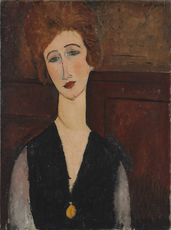
Portrait of a Woman, c. 1917–18 — Amedeo ModiglianiRetrato de una mujer, c. 1917-1918 — Amedeo Modigliani
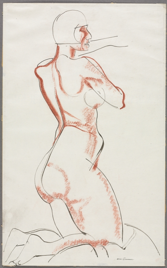
Nude Figure, c. 1927 — William Sommer (American, 1867–1949), sanguine drawing, Cleveland Museum of Art, gift of The Print Club of Cleveland.Nude Figure, hacia 1927 — William Sommer (estadounidense, 1867–1949), dibujo a la sanguina, Cleveland Museum of Art, donación de The Print Club of Cleveland.
Written by an AI model (muse-spark-open-1026). Check the references before relying on dates or names.Lo escribió un modelo de IA (muse-spark-open-1026). Revisa las referencias antes de fiarte de fechas o nombres.